Last week we posted our second article on the competencies of High Impact / High Growth companies. The article covered How to Budget Your Marketing Spend which included online and social media.
This newsletter is focused on how to make sense of the data.
Although the internet and social media platforms allow for almost unlimited flexibility you still need to chart how you want them to move through your messages.
Start with plotting how you want visitors to navigate. An example of this approach:
- Starting with an email list, publish a newsletter that is informational – things your readers want to know.
- Using your newsletter tracking function to identify how many emails bounced, how many people unsubscribed, how many are opened, and how many are clicked.
What do you know?
- Quality of mail list – too many bounces suggests the list is old, too many unsubscribed suggests the list is too generic.
- Quality of subject line – people only open emails that grab their attention. Is your subject line compelling?
- Quality of the text – does it read well, is it interesting to the reader, is there a call to action (CTA link).
A simple rule we use – only one link per email and not to your home page. Don’t make it difficult to interpret the results. Have 1 goal for the CTA and one location that is not subject to SEO traffic. Most organic searches take people to the home page, take the CTA to a different location. Good options – Blog, Landing, or eCommerce page.
Once you have them at the desired location – what is your goal? Share an email from a download, purchase something, schedule a call? Having a stated goal allows you to measure performance of the campaign.
We track campaign strategy by creating a spreadsheet and comparing the results with industry metrics and our historical record.
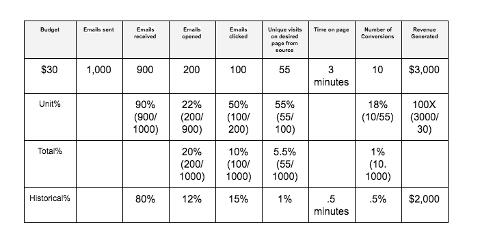
Let’s look at what this email campaign is telling us. Starting with budget we got a multiple of 100 times – $30 dollars earned $3,000 and an improvement over our average of $2,000 campaign sales.
We sent 1,000 emails and 900 were received that means we had 100 emails either bounce or the individual unsubscribed. 900 were received and 200 were opened. 22% is an average industry number and better than your average. It means you had an average subject line.
Given the 200 emails opened, 100 people read it and clicked the CTA at the bottom of the page. 50% is an excellent metric and means the text and the call to action grabbed the reader’s attention.
55 people visited the linked page. Why isn’t the number as the same as emails clicked? Not everybody will click but rather conduct their own search – don’t expect these numbers to match. Instead of spending just 30 seconds on the page, the people that clicked spent 3 minutes – a large increase over the average – a well written page.
Since your conversion goal was sales, 18 people out of the 1,000 purchased the item being featured. That turned to be a $1,000 increase from the average.
If these were my numbers, what are the conclusions?
- List needs to be curated. Review the list and see if there are names to exclude;
- I need to improve the subject line to get more opens;
- The text format and CTA in the email were dead on, continue the approach for the next campaign;
- The same is true for the web page / landing page.
The only way you can get your arms around the effectiveness of marketing spend is to track each step. For more information contact me (Bill Eastman) @833.784.7336 ext 103 and I will help you build a tracking template. Don’t forget to visit our blog post for more details.
Next Newsletter – How to further refine your offer (products or services) to better meet customer needs and prevent competitors from moving in.

Leave a Reply